


Case Studies
We have produced some bloody amazing work over the last ten years, below are a few of those projects but we are producing our best work right now if you want to see more of our work please just ask.
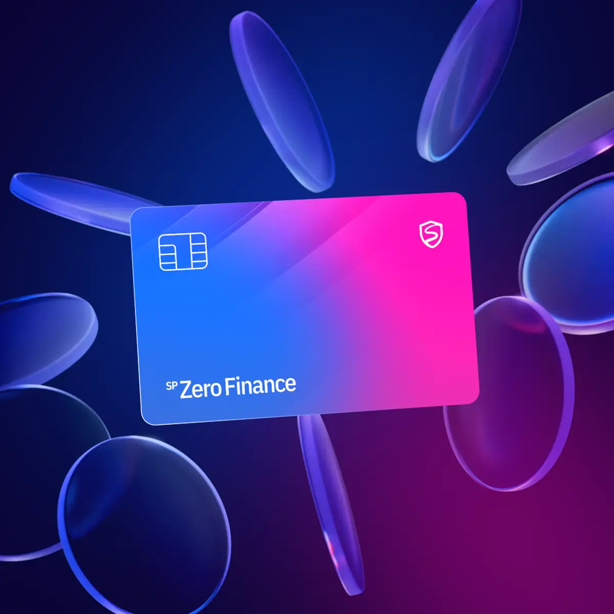
SP ZeroFinance is a global fintech offering interest-free credit built on ethical principles.
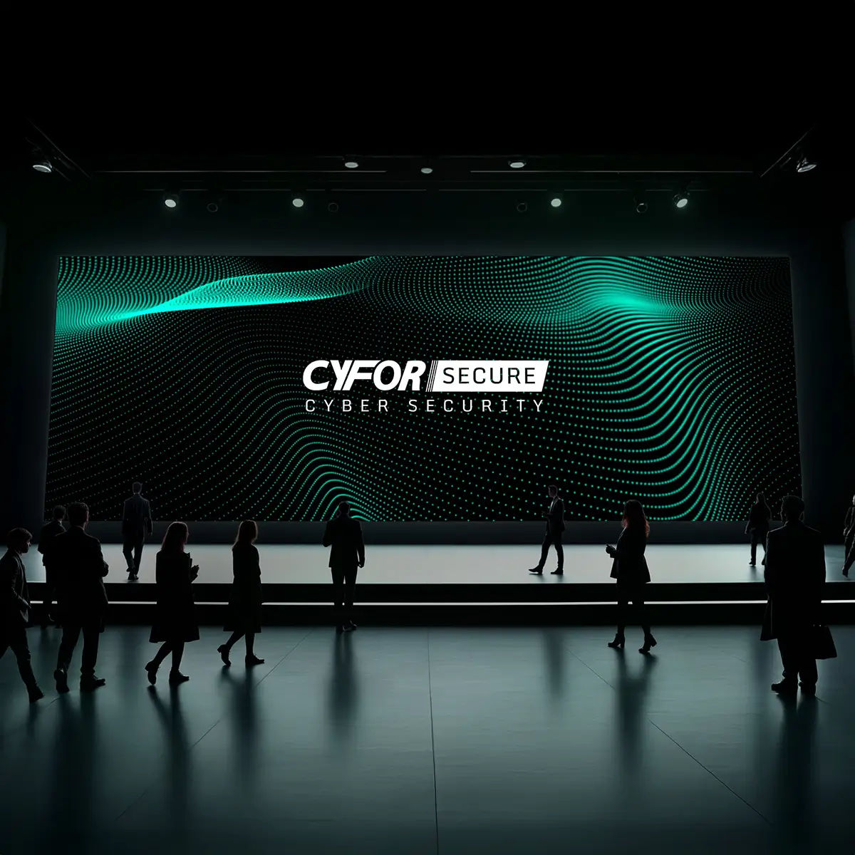
CYFOR Secure is a UK-based cyber security firm helping businesses prevent, respond to, and recover from digital threats.
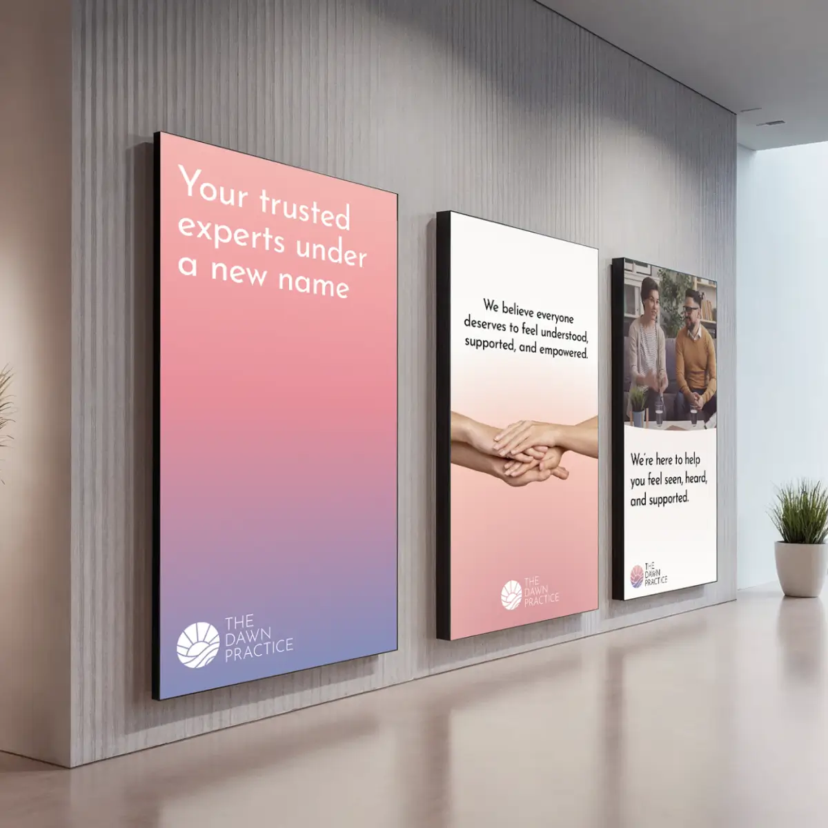
The Dawn Practice is an independent clinic offering expert psychiatry and psychology with care.

OpenWorld is a Web3 advisory firm helping crypto projects grow through expert strategy, regulation, and token design.

Limitless Finance is a specialist mortgage advisory firm supporting high-income tech professionals, contractors, and RSU earners.
